Aug 13, 2021
Five charts on the high stakes in the federal election
, BNN Bloomberg

Canadians are heading to the polls on September 20, after one of the most turbulent 18-month stretches in recent memory. Here are five charts produced by National Bank of Canada Financial Markets that show what’s at stake in this election and what kind of economy the next government will inherit.
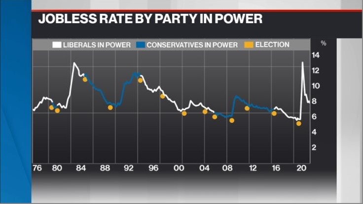
1. UNEMPLOYMENT
Millions of Canadians lost their job during the pandemic, leading to a spike in the unemployment rate. While the economy has recouped the majority of those jobs, the unemployment rate stood at 7.5 per cent as of July. This chart indicates the jobless rate through various governments and when elections were held throughout that time.
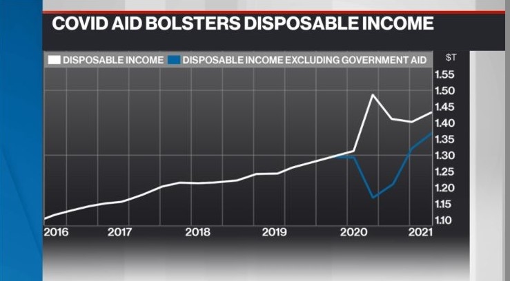
2. GOVERNMENT AID
Canada rolled out billions of dollars in income support for those impacted by the pandemic. This chart shows the difference in Canadians’ disposable income with government aid, and what would’ve happened if zero COVID support was deployed. The question for the next federal government will be: how and when should this aid be removed?
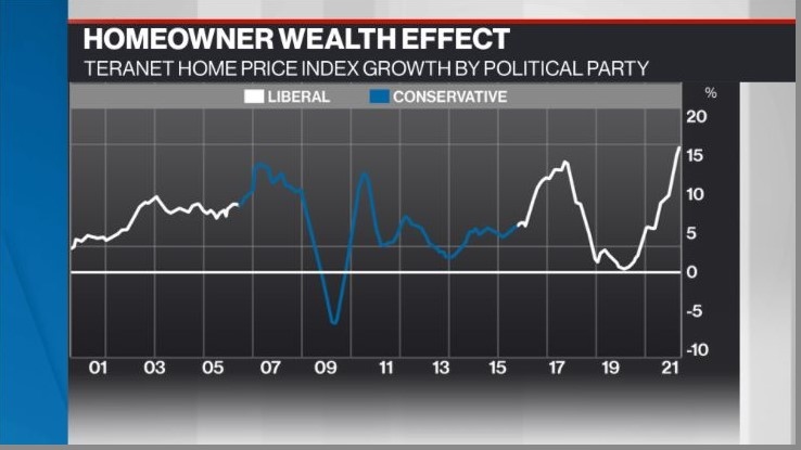
3. WEALTH EFFECT
Real estate has undoubtedly been one of the most resilient sectors throughout COVID-19, propelled higher by historically low interest rates. It’s created a wealth effect among homeowners -- meaning they tend to feel richer as the price of their home increases.
With the economy improving, the Bank of Canada has indicated interest rates could begin moving higher in the second half of next year. The next government will have to consider how this could affect consumer spending and the economy if there’s a cooling in the housing sector. This chart shows the year-over-year per cent change in the Teranet-National Bank Home Price Index, segmented by the political party in power at the time.
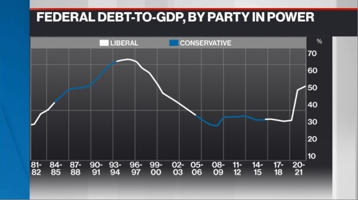
4. DEBT BURDEN
Canada’s next federal government will inherit financial books that are dripping in red ink. Some chief executive officers have voiced their concern about mounting government debt in BNN Bloomberg interviews over the past 18 months. However, the Trudeau government has touted the federal debt-to-GDP ratio as one of the main reasons why the current debt burden is sustainable. This chart demonstrates that ratio, by which political party was in power at the time.
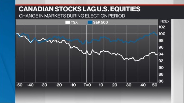
5. STOCKS
This chart shows how equities on both sides of the border have tended to perform during an election period. Canadian stocks tend to underperform compared to American equities. "Federal elections appear to have been something of a lunch bag let down for Canadian equities,” Warren Lovely, chief rates and public sector strategist at National Bank, wrote in his note. The vertical line indicates 50 days before and after an election vote, and amalgamates market data around election periods over the past 20 years.
Politics


BNN Bloomberg Picks
-
 7:07
7:07Copper price surges as investors pile in to looming supply gap
-
 11:57
11:57Uncertainty in Canada's tax landscape could weigh on investment: economist
-
 5:22
5:22NHL playoff runs give local businesses a major boost: Moneris
-
 4:00
4:00Ottawa moves to raise inclusion rate on capital gains taxes in 2024 budget
-
 8:19
8:19What's the neutral rate, and why did the Bank of Canada raise it?
-
 4:55
4:55Some of the key highlights from the Liberal government's 2024 federal budget