Jan 25, 2021
Larry Berman: Credit markets not pricing economic risks correctly
By Larry Berman
Larry Berman: Credit markets are mispricing risk
VIDEO SIGN OUT
The continued saga over the central bank printing press is creating a degree of moral hazard never seen before. In the S&P 500, there are about 10 per cent of companies that do not earn enough to cover their interest payments and about 150 that are not investment grade. These are being kept alive by cheap money—and this was all happening before COVID.
The numbers are worse today, though implied support from the central bank makes the risks involved with owning weak companies very distorted. High yield spreads should probably be several hundred basis points wider than they are today without the implied support. But don’t worry, just buy what the U.S. Federal Reserve says they will buy and don’t fight the Fed. Central bank policies are creating a massive asset bubble, but there is no telling when it breaks. When they think about thinking about pulling back, look out below.
Credit markets may be a leading indicator. This is another part of our PRO-II series of indicators that is currently flashing a cautionary message. But as history shows, credit spreads can stay narrow for extended periods of time before widening.
A wider spread is telling markets risks are increasing. My first chart shows the yield to worst maturity. It shows that all levels - government, corporate investment-grade and high-yield - are all at or near record low levels.
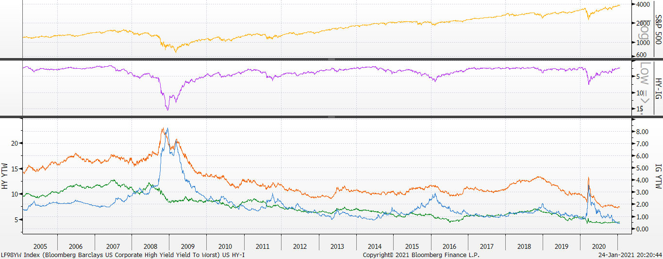
The middle chart is the spread between investment-grade and high-yield. This is the difference between quality companies and weak ones that are mostly just hanging on largely because of cheap money. If they had to pay historical risk rates, many would not make it. These are the zombies. Many should go bankrupt.
You can see the high correlation between credit spreads and equity markets. What is key here are divergences: That is when equities make a new high and credit spreads do not narrow. We have not seen this yet, but we are looking very closely now as U.S. equities are reaching new highs.
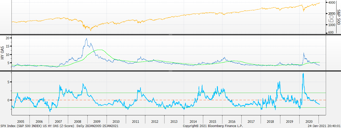
Another leading indicator is the high-yield spread relative to “safe” government debt. This is another metric in our model as a leading indicator. This is often where the divergences tend to show up first. The bottom chart is what is called a Z-Score of the high yield spread. Z-Score is a statistical measure of how far the underlying yield has deviated from the mean and gives us a precise, apples-to-apples measurement for divergences.
The S&P 500 is hitting new highs, but credit spreads for high yields are lagging. Time will tell if this is a meaningful signal, but I think it has to be. It likely depends on the Fed and implied support for markets (moral hazard). Without it, I think the S&P 500 would be about 30 per cent lower.
The Fed meets this week and it’s doubtful they say anything negative. But as I noted last week, bond supply is massive and the Fed is not buying enough. Let’s watch credit markets and the central bank support for credit markets. Sadly, they may need to do even more to keep the party going.
Look for more in the coming weeks from our new Berman’s Call Probable Return on Investment Index, PRO-II Indicator. We will be launching the new website soon so that BNN viewers can follow along with the various risk and opportunity factors we follow.
Follow Larry online:
Twitter: @LarryBermanETF
YouTube: Larry Berman Official
LinkedIn Group: ETF Capital Management
Facebook: ETF Capital Management
Web: www.etfcm.com


 in New York, U.S., on Wednesday, June 17, 2020. U.S. stocks fluctuated as the recent rally begins to show signs of losing momentum amid a worrying increase in coronavirus cases., Bloomberg")


